Before I became known for exposing a fraudster, I spent a decade in tech — including as a senior UX designer for Norway’s state housing bank. My job was to make systems feel easy and safe to use, especially for vulnerable people.
But then I was defrauded out of over £200,000 by someone I thought I loved.
And suddenly, I saw the system from the other side.
I kept thinking afterwards:
Why was taking out a high-interest loan just as easy as buying a dress at H&M?
That question changed everything. I used to design for less friction, until I became the kind of user our systems weren’t built to protect.
The design I believed in
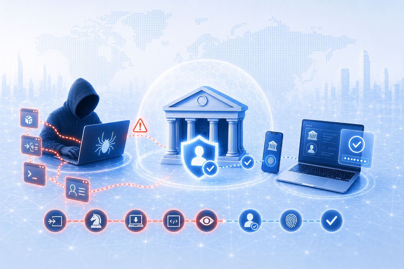
In Norway, we have a strong digital identity infrastructure through BankID. But in 2017, in an effort to accelerate digitalisation, the government removed safeguards: no more witnesses required for loans, old income documentation allowed, fewer pauses or checks.
From a tech and digitalisation perspective, these were wins. From a fraud perspective, they were open doors.
In my role, I’d interviewed people in debt, but I didn’t truly feel what they were up against until I became one of them. And ironically, the same design values I championed — speed, ease, trust — had helped enable it.
I even wrote my fraudster, mid-scam:
“I’m almost scared of how easy it is to get loans in Norway without security. No wonder people go bankrupt here.”
Looking back, that was my UX brain kicking in: Seeing the flaw in a system designed for convenience, not caution.
Frictionless design started with good intentions
In the early days of digital transformation, the goal was speed and simplicity: fewer clicks, faster flows, happier users. And in retail, that logic makes sense. Brands like Amazon and H&M want you to go from “want” to “buy” in seconds. In our busy lives, convenience sells — we crave ease.
And let’s be honest: institutions have saved billions by streamlining services and replacing human checks. But when that same logic is applied to high-risk transactions, like taking out loans or moving life savings, it can be devastating.
Frictionless design assumes ease is always good. That one seamless journey works for everyone. But it doesn’t. Because what’s convenient for a business, or a fraudster, might be dangerous for someone under stress.
In fraud prevention, good friction can be life-saving. Not the annoying kind, but intentional, human-protective design. Quiet moments that slow things down just enough to spark awareness.
In UX, friction used to be the enemy. We praised “fewer clicks” and “faster flows.” But when the outcome is a five-figure loan or an irreversible crypto transfer, speed can become a vulnerability.
Researchers call this “positive friction”, design that interrupts autopilot and nudges more deliberate choices. Micro-pauses that reduce error, build trust, and help people recognize risky behavior before it’s too late.
I know it’s hard. These systems took years to build. No one wants to make them “harder.” But when criminals are exploiting that ease to steal identities and drain accounts, we have to rethink what good design really means.
As UX designers, we know how to make things easy. But we also know how to make things safer. Smart friction doesn’t block users. It protects them.
And this isn’t just about one person losing money. These scams are fueling operations tied to trafficking, terrorism, and large-scale financial crime. This isn’t a customer service issue — it’s a national security issue.
As fraud grows more organized, prevention isn’t just an IT task, it’s part of the user experience. As industry expert Karen Boyer said: “Fraud is the friction. Fraud prevention is the new customer service.”
The takeaway
Digital design can be fast, beautiful, and empowering. But it must also be responsible. If we want to reduce fraud and protect people, we need to stop chasing frictionless at all costs — and start designing systems that respect the full complexity of being human.
Because criminals already know where our blind spots are. We shouldn’t leave them there.